Material Design Tutorial: Everything You Need to Know About Google Material Design
If you are a designer, or even if you are not, you may have already come across the phrase Material Design. It’s new, it’s rich in features, and the phrase is heard popping up in almost all conversations nowadays. You probably got a hint that it’s something to do with designing. If you are thinking on that line, then probably you aren’t wrong, but you have missed all the great news. Designers and technologists all across the world are all praises for Material Design, and for good reason. With Material Design, Google introduces a visual language that integrates the standard principles of good design with the possibilities of technological innovation.
So, what exactly is Material Design? It’s creating quite a stir in the designing fraternity following its launch in 2014. But, do you actually need it? Do the designers need to completely reconsider their app and web designing processes? This blog aims to answer all these questions and more with Google material design example. So, read on and find out more.
What is Material Design?
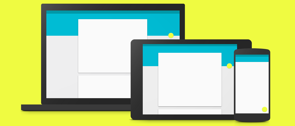
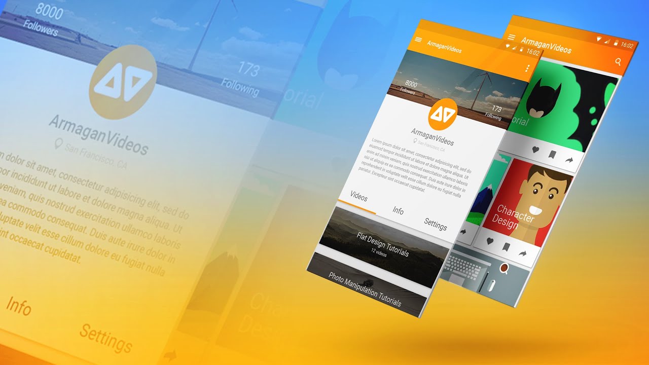
In short, Material Design is a visual language created by the folks at Google. Codenamed as Quantum Paper, it aims to benefit the user by making the designing procedure uncomplicated. It’s more of a concept based on a set of goals and principles, rather than a fixed framework for designing. The idea here is to think more about designing and ways to improve it. A document is publicly available and it serves as a basis for this Material Design concept. It uses more grid-based layouts, transitions, paddings, and depth effects like light and shadows. It aims to provide a single system for consistent and unified experience in different platforms and screen sizes. In addition, Material Design also provides some design standards for building applications across different platforms like the web, Android and iOS.
Material Design Principles
As mentioned earlier, Google’s Material Design follows some principles to improve designing. The many guiding factors for material design are all set to enhance the user experience where this is used. The guiding factors break down into a set of specific concepts and treatments, where Google has tried to set some new ‘rules’ for creating animation, style, patterns, and other design parameters. The principles of Material Design are listed as follows:
Material is a Metaphor
‘Material,’ here, is used as a metaphor and is based on a more tactile reality. It is inspired based on the study of paper and ink and provides a more realistic experience at times of interaction by users. However, unlike real paper, the material can perform various exercises like splitting, rearranging, and can even be moved by the users.
Bold, Graphic, and Intentional
Elements like grids, spaces, typography etc. create meaning and focus. The enhanced User Experience is also a result of color choice and brilliant imagery throughout.
Motion Provides Meaning
Moving objects or animation, in Material Design, do not interrupt the User Experience in any way. In fact, it enhances it and provides coherence and consistency.
Pros of Material Design
The guiding theory of Material Design is that material is based on reality. Objects in Material Design reside in an almost 3D space. When it comes to aesthetics, it falls somewhere between flat design and skeuomorphism. There are many benefits of using Material Design over flat design or skeuomorphism. But, before stating those, let’s take a look at what flat design or skeuomorphism lacks in.
In the case of Skeuomorphism, where items resemble their real-world counterparts, the load time is high and is also limited in its scope as to how the items are supposed to look. Flat design, on the other hand, is also limited in its number of colors, shapes, or iconography. Here is where Material Design comes into play. The pros of using Material Design are listed below:
- It provides a clear guideline for app development in Android, web, and iOS.
- Animation is one strong feature of Material Design, and it provides many in-built features to make life easier.
Color and Icons in Material Design
From the point of view of a designer or a user, colors are perhaps the most important part of an app. Proper colors can enhance the look and feel of an app. While improper color choices can result in poor User Experience.
Material Design is loaded with a great collection of colors that the designers can make use of to create a robust User-interface. It comes with an in-built color tool that measures the color combination and provides suggestions for which the look and feel of the user interface will be livelier.
Icons are universal and when used correctly will enhance the user experience and usability of the app. Think of emojis. They somehow express more than words ever can. In Material Design, icons are classified into two categories: Product icons and System icons. While the Product icons effectively communicate the core idea of the product, the System icons represent a file, directory or anything related to the system.
Writing and Typography in Material Design
Typography guidelines are basic in Material Design. Roboto and Noto are the default font for all applications and are available for download in the framework.
Layout and Design
Material Design uses layouts that are based on the principles of print-based design. It makes use of some tools like baseline grids and structural templates to improve consistency across every devices and environment. These layouts can build apps that are scalable, meaning, they easily fit all screen sizes.
Components in Material Design
Every element in Material Design is precisely defined. From how to use it to where you should use it, Material Design is a platform that doesn’t miss anything. There are a total of 19 elements. Some of them are bottom sheets, cards, chips, dialogs, and dividers.
Patterns in Material Design
Material Design also comes packed with powerful patterns which can be used to improve the User-Interface. These patterns include navigation drawer, settings, scrolling technique etc.
Animation in Material Design
Material Design comes power-packed with robust animation features. Animation is the strongest feature of Material Design, and every animation in it has meaningful, consistent, and right transitions.
Google Material Design example is perhaps the most versatile and accurate designing platforms available today. It comes with complete rules and guidelines to create an app. However, that is where the question lies. Do experienced designers actually need so many guidelines? While the beginners in designing will find it extremely helpful for designing an app, the more experienced ones will find it unnecessary. Having said that, one never really knows until one starts using the framework. While most of Google’s mobile applications for Android like YouTube, Google Docs, or Google Maps are already applying this Material Design, whether you will use it to build your application is but a matter of choice. With its power-packed features and impressive documentation, it sure seems worth a shot.
FAQs
- What are Material Design guidelines?
Material Design provides a comprehensive guide for motion and interaction design to be used in various devices and platforms.
- What is DP in Material Design?
Google’s definition of DP is as follows:
A DP is equal to one physical pixel on a screen with a density of 160

