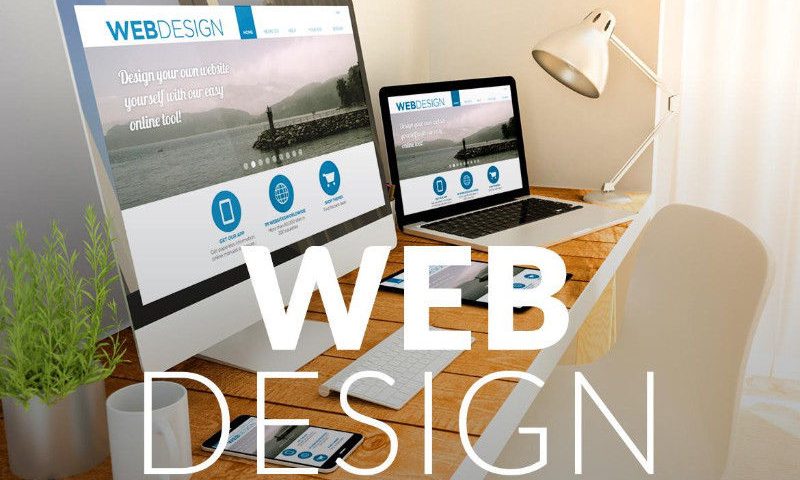
Secret Behind A Successful Web Design
Navigation Header Design- The Secret Behind a Successful Web Design
You don’t get a second chance for creating the first impression. This rings true especially in the digital field with high competition and diversity. When you look at a web design, certain spots hold your attention. The header of a website is one of the most critical parts of the website design.
Knowing The Header
Header, be it a website or a doc, is always on the top. In the website, it houses the navigation and the logo. And since it stays on the top, it steals the first show.
It tells your visitors about your brand, and about your work when they land on your website. Hence, the header is the most important part of web design. It should be neat, concise, catchy, and relevant.
Headers are also called site menus for the obvious reason they are positioned as an essential element of the navigation. And since the header remains condensed, you can have some fun with the rest of the page. If you make the header big, the rest of the page will have less space for adding elements.
Contents In The Header
Now that you know how vital the header is in web design, you must also know what it must have absolutely and what else it can carry if you still have some space left on the header.
Company Logo
It is a must to have your company logo in the header design. The logo must follow the guidelines of the brand. It should be responsive to the scrolling of the page. Also, pay attention to the color of your header. You don’t want to have a blue logo on the header a the black background.
Navigation
Navigation in web design is an important aspect. It contains the way to all the pages on the website. This is how the users find what they need, and that makes this section crucial. Make sure your navigation is easy and neat.
Conversion Tactic Or CTA
If you want the visitors to take a certain action, you must include it into the header. You can suggest them to contact you, find your local store or sales representatives, ordering, etc.
Contact Details
The header must have your contact details like phone number and email address. This will make it easy for the visitors to get in touch with you whenever they want.
Login Section
This isn’t a must-have section for the header, but if you can accommodate it in the web design, you should consider keeping it.
Search Bar
This is yet another feature you can include in the header. A search bar will make it easy for the visitors to search for the product or service they are looking for.
Announcement Section
You can also include an announcement section in the header for letting the users know about the important upcoming events related to your website and company.
Shopping Cart
If you are an e-commerce company, you can also place the shopping cart on the header. This will make their shopping experience smoother.
Now that we are done with the header in web design, let’s zoom into studying the navigation part.
Navigation Hierarchy
People are landing on your web page because they want something that you can provide. And navigation is a way to tell them about your capabilities. Hence, it is an essential part that cannot be ignored.
Now, ideal navigation varies with industries and businesses. So, here are the types of navigation you can make use of in your web design.
Main Navigation
The main navigation is meant to let the visitors know what kind of business you are conducting. This section must have sub-sections relevant to your main offering.
For example, if you are a services-related company, it won’t make any sense if you put in product sections in your main navigation. If you have a few pages, you can include them all in the main navigation. However, if you have many sections, you will have to prioritize the sections and categorize them accordingly.
Utility Navigation
This category of navigation carries the secondary action you think the visitors could take. The utility navigation can have options like careers in your business, the shopping cart, logging in section, etc.
You can also mention your contact details here. This navigation section isn’t as important as the main navigation. You can place them above the main menu or at the right-hand side corner in your web design.
Mega Navigation
If there is any website that portrays a perfect example of mega navigation, it is Amazon. And why not? Amazon offers almost every product you can think of. It has a vast offering, and hence, it needs more than mega navigation menu to let its visitors know of its product.
Usually, this navigation is found on the websites of e-commerce for making the visitors buy the products. But, before you go for mega navigation, remember, you must have ample space for it.
Third Level Navigation
In many sites, you must have seen the main menu has drop downs, and these drop downs have sub-menus. This is called third-level navigation. This form of navigation comes in hand especially when you have products that stand out or sub-categories of what you are offering.
Placing The Navigation
Placing the navigation at the right spot is vital for a successful web design. Here are a few options where you can place the Navigation.
Sticky Header Navigation
If you are willing to provide as much information as possible to your visitors in the first glance, you can put the navigation in the biggest header. And not just that, when the visitor scrolls down, your header should truncate and still stay with them. But make sure that doesn’t overwhelm them.
Horizontal Navigation
Horizontal navigation serves the purpose of the maximum viewport in comparatively lesser space. And because we read from left to right, it is easier for the users to scan the navigation.
Vertical Navigation
So far, we have been discussing the Horizontal Navigation. However, at times, vertical navigation comes in handy for many e-commerce websites. Using the vertical navigation ensures that the visitor can still see your main menu while looking for the available products. You should use vertical navigation like a secondary area for your applications.
Hamburger Navigation
This kind of navigation once ran the show. The websites used to have three lines in the name of menus. So, the visitors had to click them before they could see the main menu. Well, this is a little inconvenient. A visitor must be able to look at your main menu to decide whether he wants to invest or not. Pushing him to take some action could annoy him.
But this navigation plays a vital role in making mobile websites neat and easy flowing. The compact menu doesn’t occupy much space, leaving you a lot of space to play with.
So, here we are done with the header and navigation. However, this is just one section of your website or better said, homepage. There is a lot more to a website than just these two, but they hold a vital place and are essential in creating an excellent first impression on your visitors and make them come back to your website.


